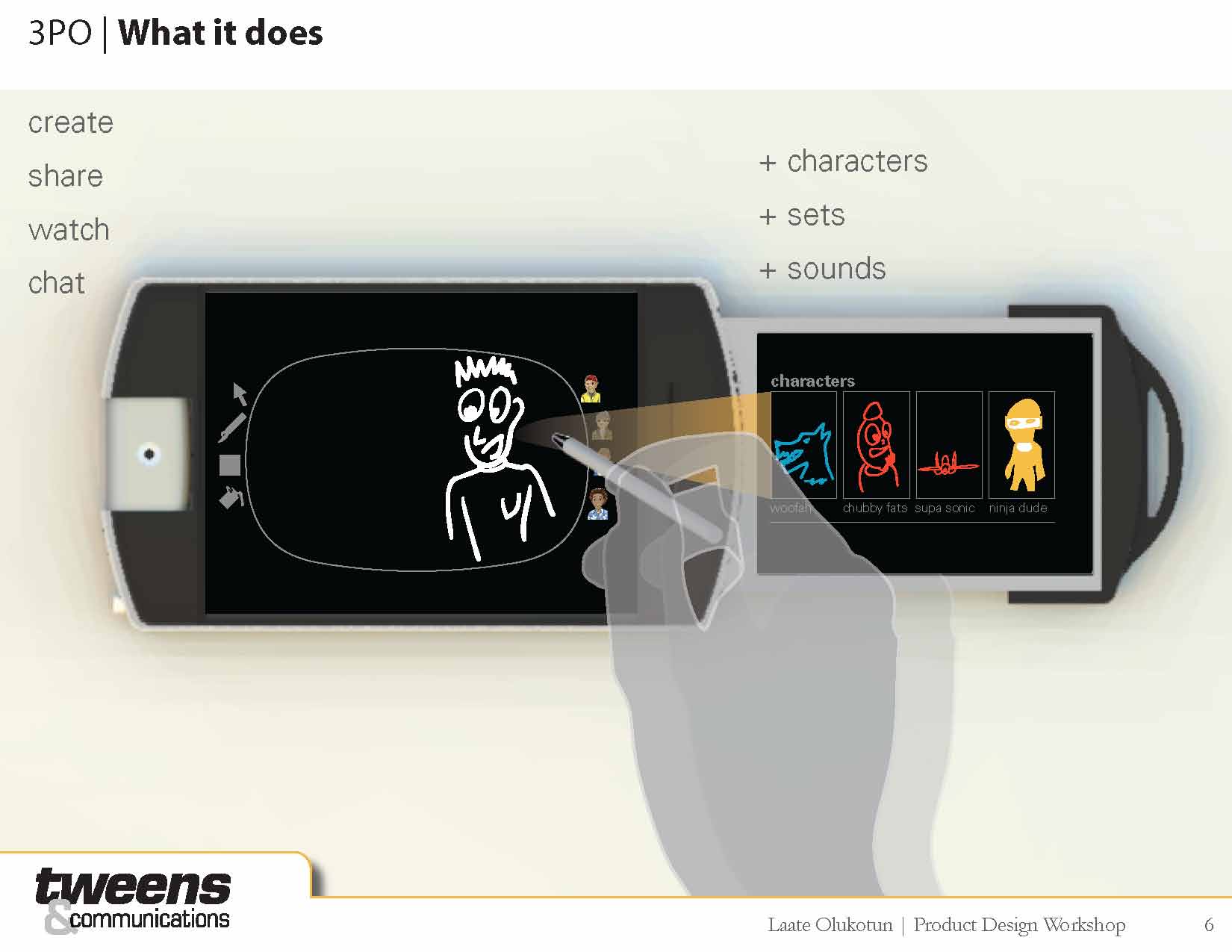
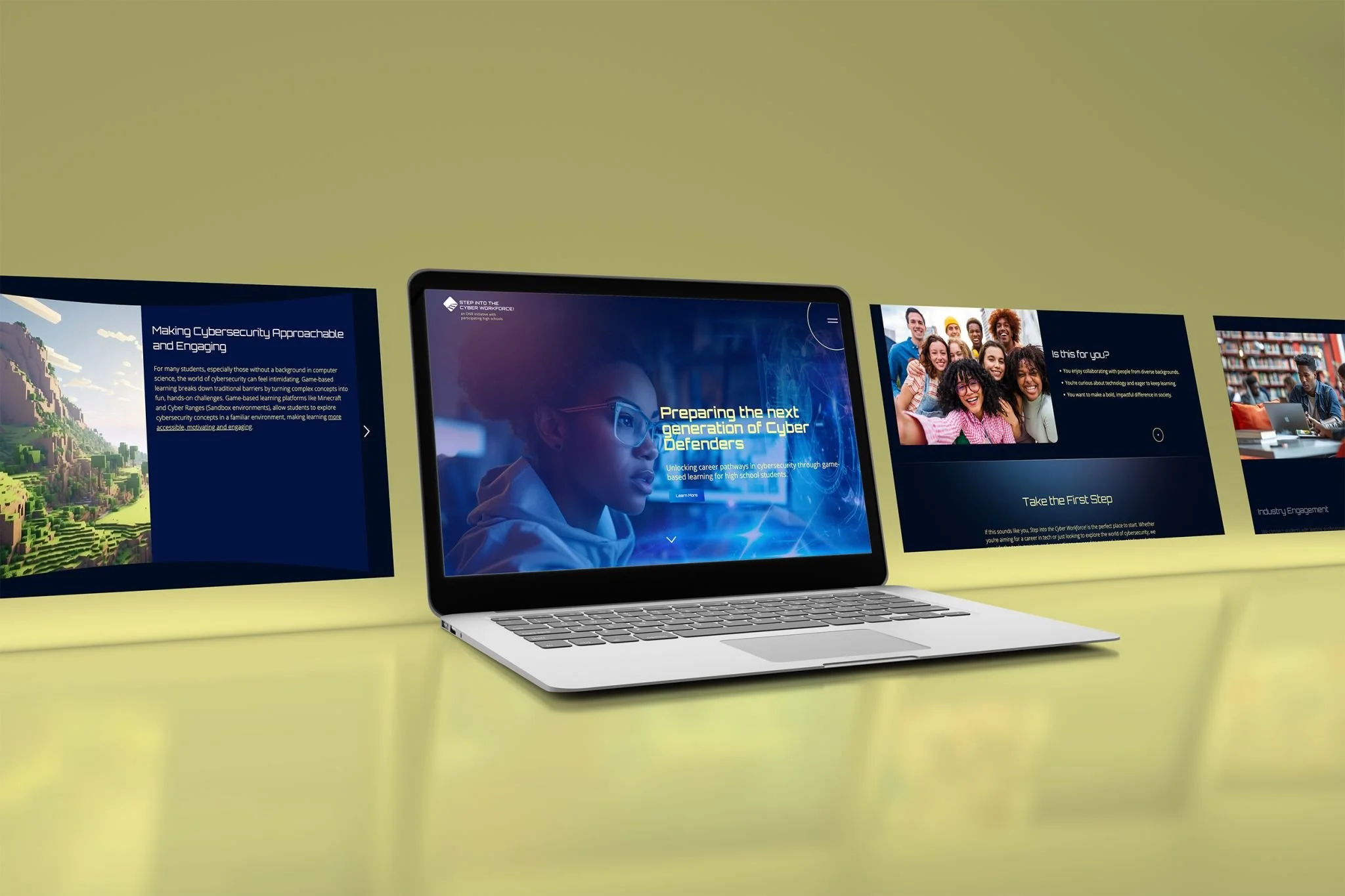
A Gaming-Inspired Educational Platform
Meucci & Company partnered with Seaberry Design to create an innovative digital platform for the Office of Naval Research (ONR). Building on their successful track record of collaboration, this third project aimed to revolutionize how students engage with cybersecurity education. The vision was ambitious: transform ONR's educational content into a gaming-inspired digital experience that would appeal to high school students while maintaining the professional standards expected of a government initiative.
Challenge
ONR faced a critical workforce gap, with over 800,000 cybersecurity job openings in the US. Seaberry Design's task was to create an engaging platform that would resonate with tech-savvy youth while providing comprehensive resources for educators. Without existing brand guidelines, the project required developing a complete visual identity that could bridge the gap between gaming aesthetics and educational credibility.
Process
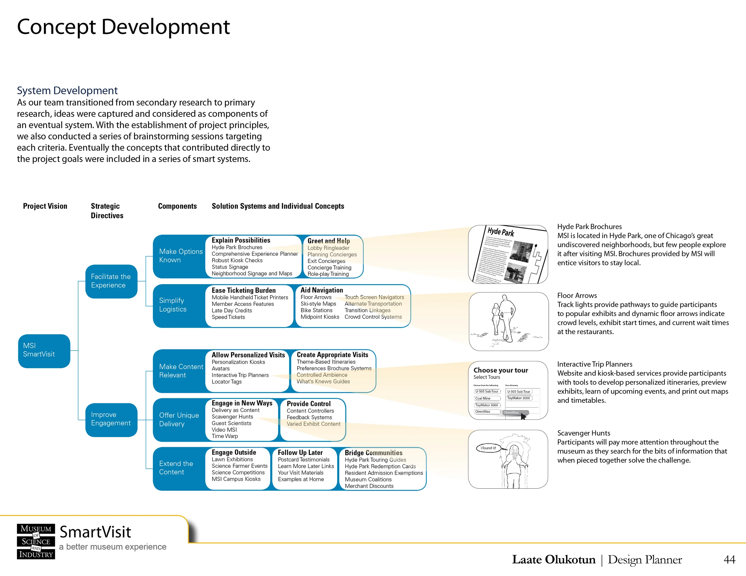
Content Strategy
Meucci demonstrated exceptional project preparation by providing a comprehensive content document that outlined clear messaging for each audience segment. The content strategy addressed two distinct user groups: students exploring cybersecurity careers and educators seeking teaching resources. For students, the content highlighted certification paths, hands-on learning experiences, and career opportunities. For educators, it emphasized professional development and a $250 stipend program.
Brand Development
Seaberry Design created a complete sub-brand inspired by contemporary gaming platforms. The visual language struck a careful balance between professional credibility and engaging aesthetics that would resonate with digital natives. The design system effectively supported key program elements including Microsoft certification paths, Navy partnerships, and career development opportunities.
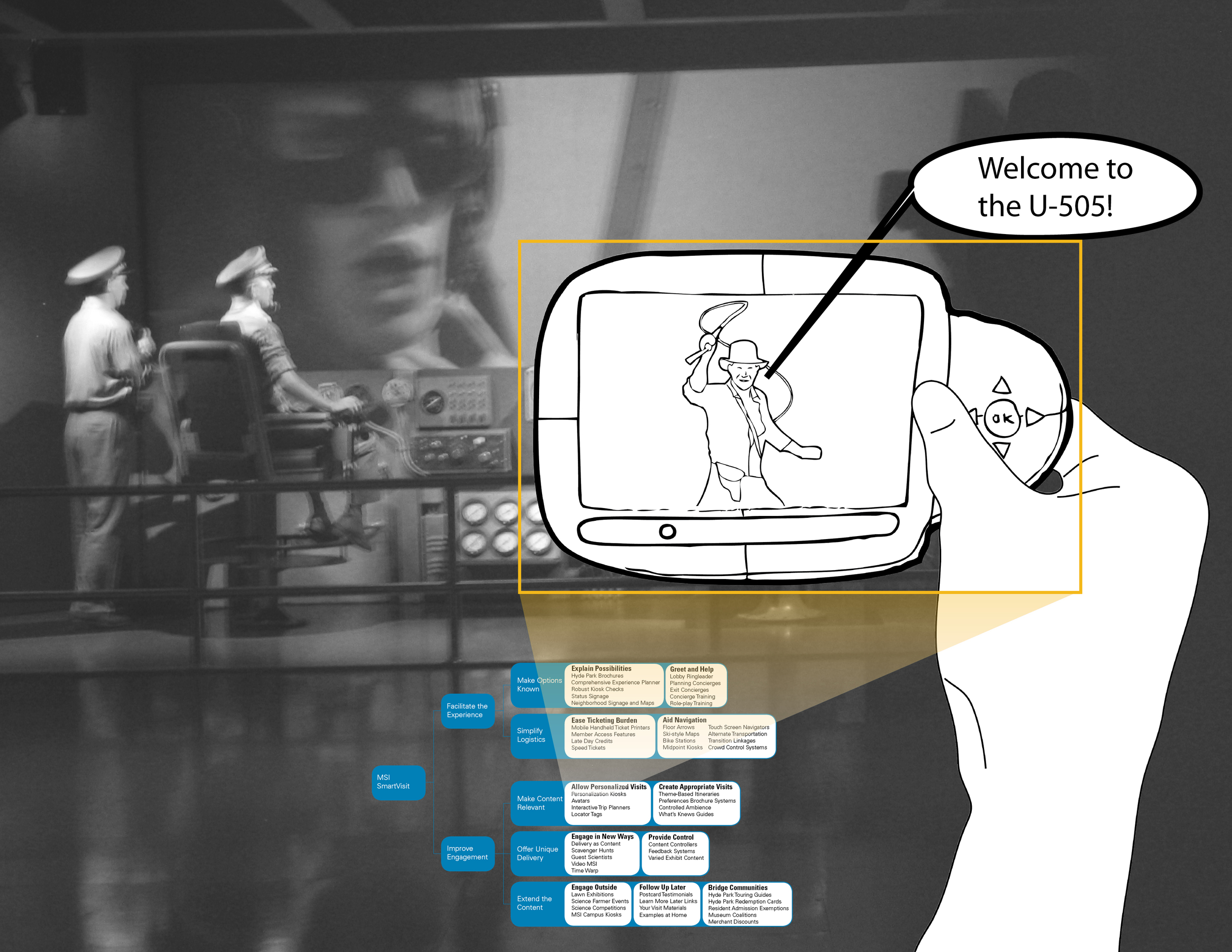
Technical Implementation
Working with web development partner Seaberry Design delivered a dynamic platform capable of serving different user groups with targeted content experiences. Built in Webflow, the final product showcases interactive elements that mirror the program's game-based learning approach while maintaining the professional polish required for government and educational institutions.
Results
The launched platform successfully unites multiple stakeholder needs: students seeking cybersecurity career paths, educators requiring teaching resources, and ONR's mission to address the cybersecurity workforce gap. Early feedback has shown strong engagement from both target audiences, with particular praise for the gaming-inspired interface that makes technical content approachable and engaging.
Impact
This third successful collaboration between Meucci and Seaberry Design – with Laaté leading all three projects – demonstrates how gaming aesthetics can effectively present professional content while maintaining credibility. The content-first approach proved essential in crafting distinct user journeys for students and educators while maintaining a cohesive brand experience. The project sets a new standard for educational platforms in the government sector, showing how innovative design thinking can help address critical workforce challenges.